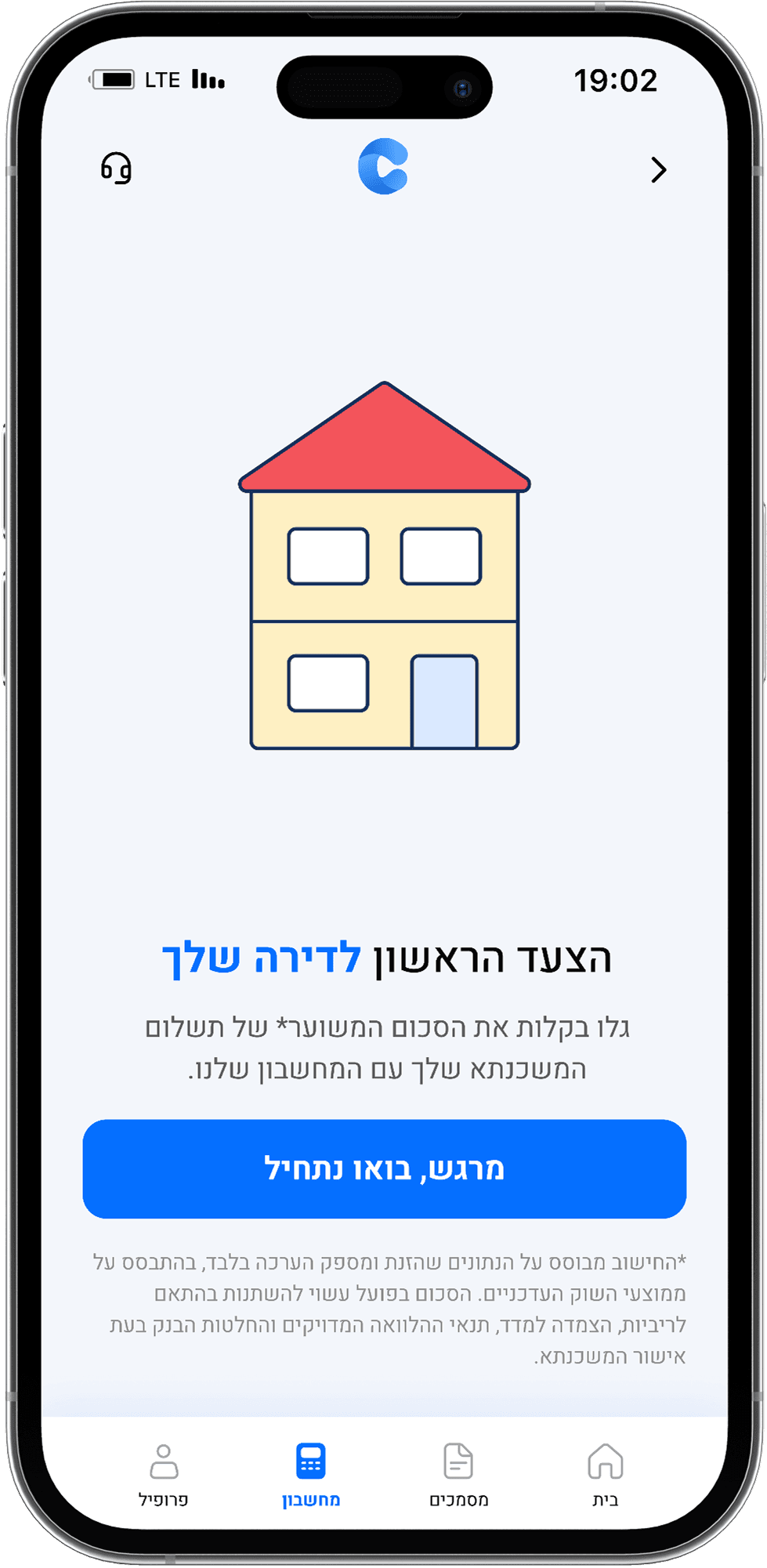
הצעד הראשון לדירה שלך


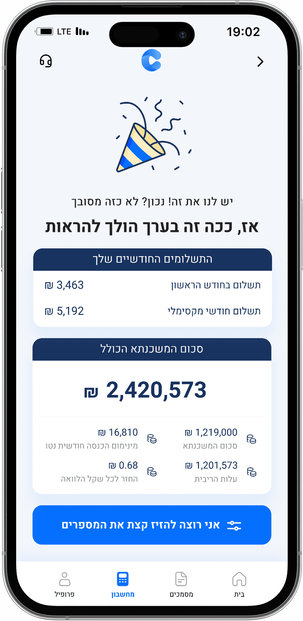
3,463 ₪
תשלום בחודש הראשון
5,192 ₪
תשלום חודשי מקסימלי
₪
2,420,573
סכום המשכנתא הכולל
Mortgage Calculator
2025
Design Field
UX.UI (App Design)
Client
My work at cantaio (Intership)
Team
Hagar Babai + Me
The Brief
The calculator allows users to estimate their potential mortgage in just a few simple steps. The main goal of this tool is to help the company make a strong impression on users and leads, combining professionalism with a sense of ease. Together with my teammate Hagar, we achieved this through thoughtful work on microcopy, a fresh and friendly illustration style, clear information architecture, and a positive overall user experience..
PRD analysis

The most important points Hagar & I extracted
from the PRD.
1
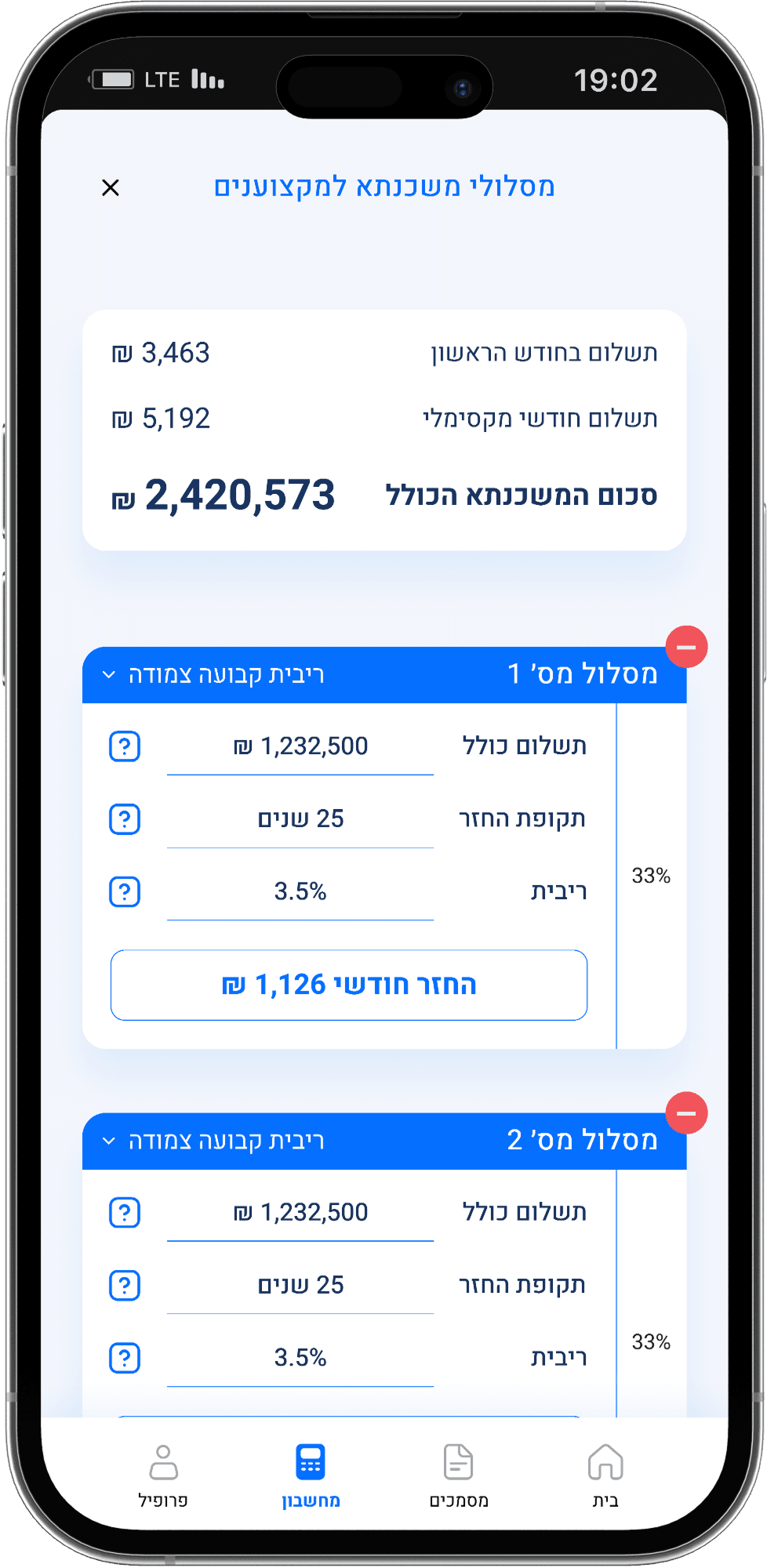
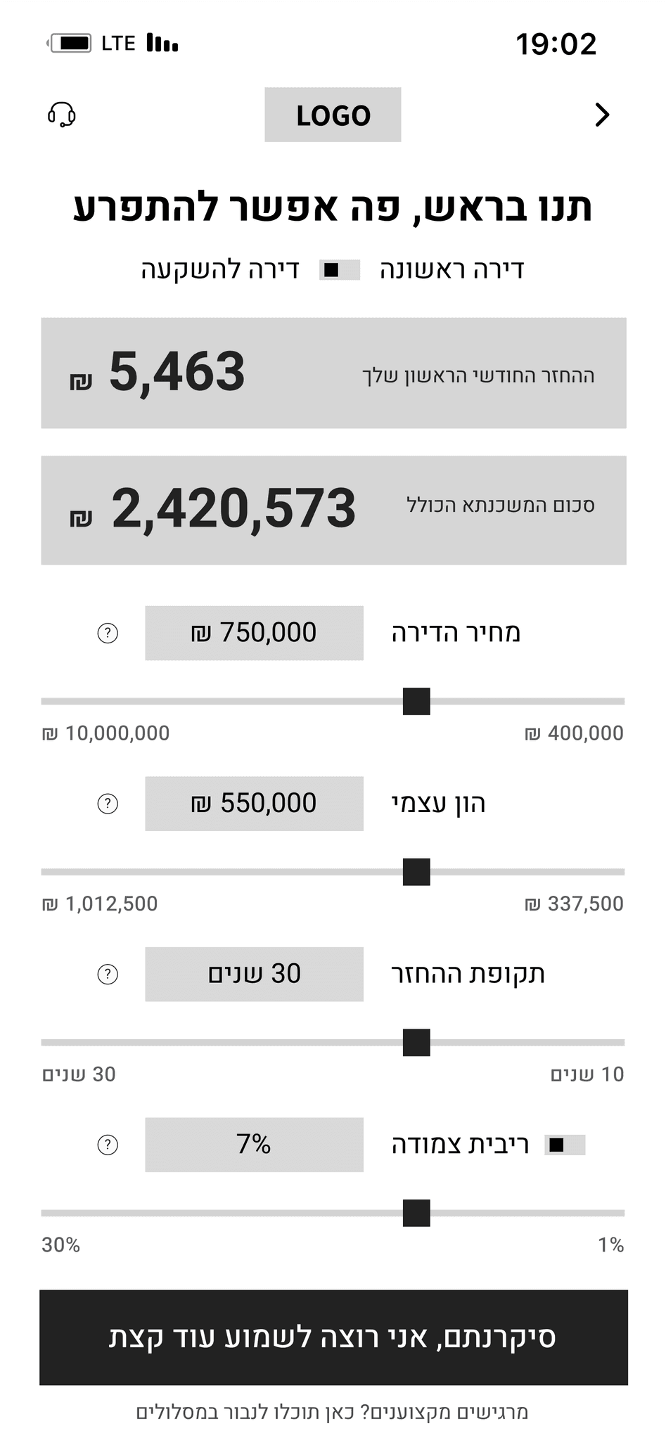
The monthly payment is the most important number for the user, it should be big, clear, and always visible after calculation.
2
Users should be able to change values (like interest, years, down payment) easily using sliders and text boxes, and see results update right away.
3
The tool should feel friendly and simple, with short explanations next to each number so users understand what everything means.
Competitive analysis
We reviewed the existing mortgage calculators available today,
both from banks and independent platforms.

Limon Mortgages

Mizrahi Tfahot Bank

Guru Mortgages
JTBD
When I start thinking about buying a home, but don’t know where to begin…

1
As a first-time user, I want to know how much I’ll pay each month so I can feel financially confident about buying a home.
2
As a curious user, I want to play with mortgage settings so I can see different scenarios and understand how each change affects my payments.
3
As someone who doesn’t understand finance terms, I want simple explanations so I don’t feel confused or overwhelmed.
4
As a user in an important decision-making process, I want to feel that the system is thinking for me, so I can trust it more.
5
As an advanced user, I want to break down the mortgage into different tracks myself so I can fully customize it to my needs.
Wireframes
Round 1/3 — creating the 1st layout

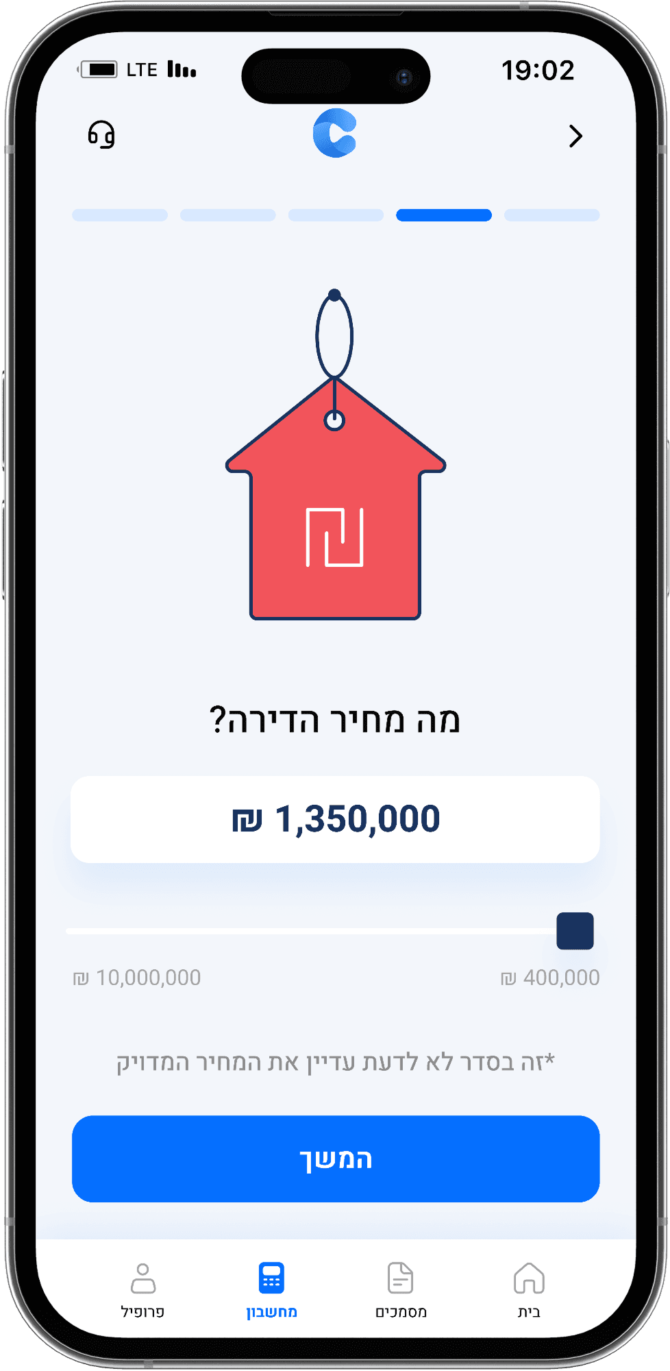
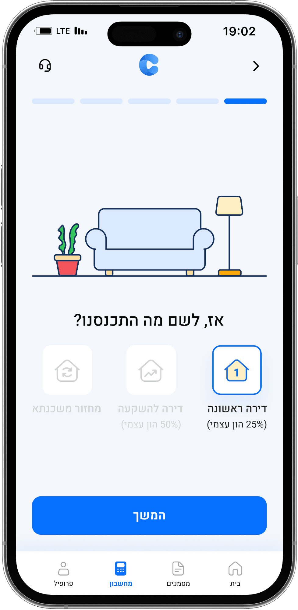
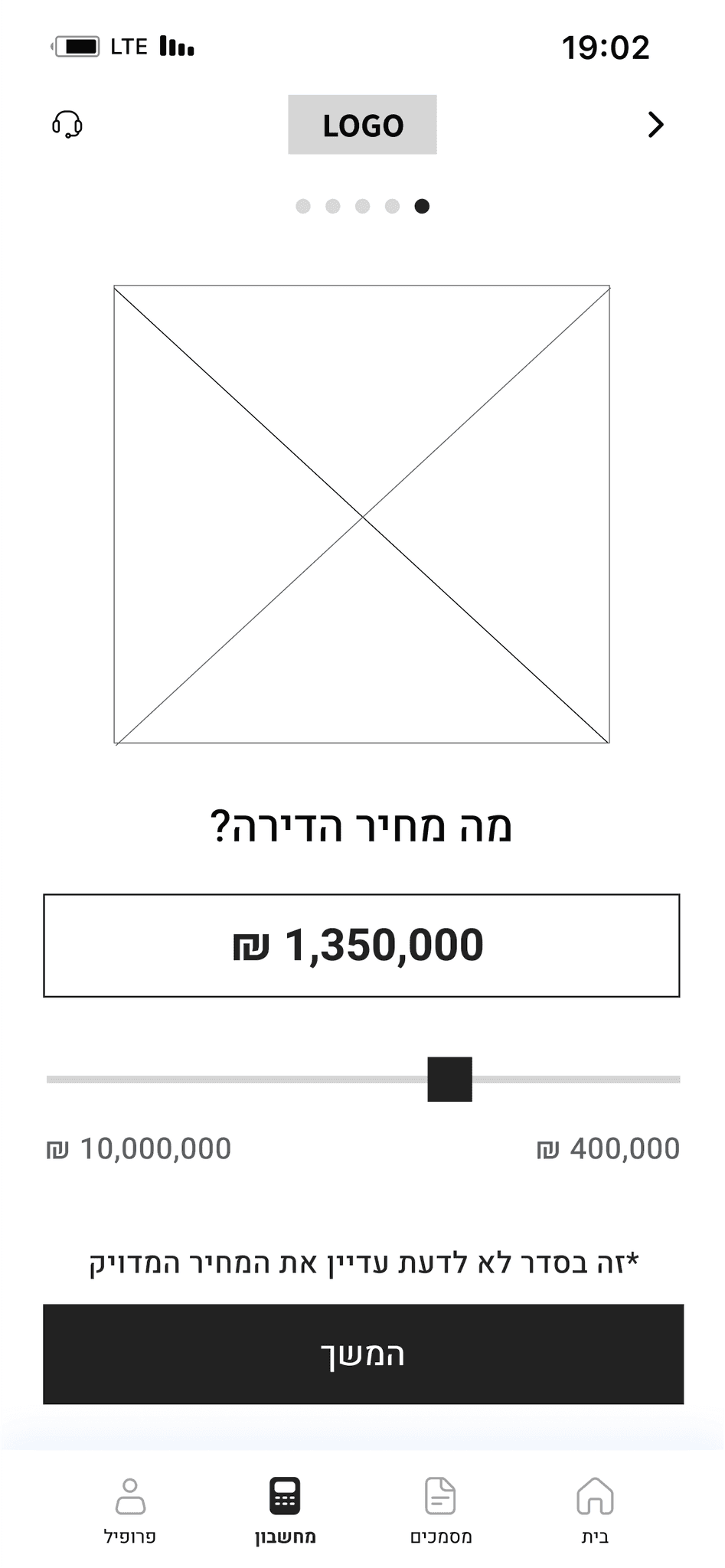
Property type screen

Property price screen
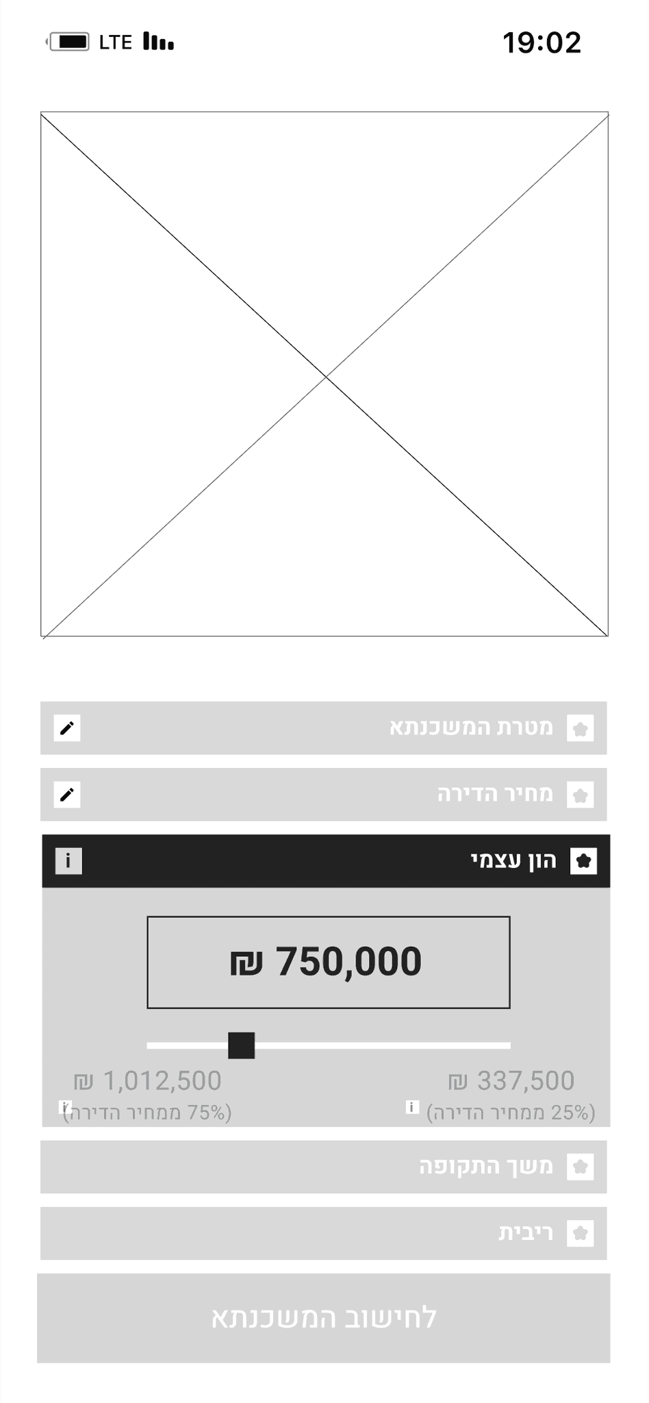
Equity screen
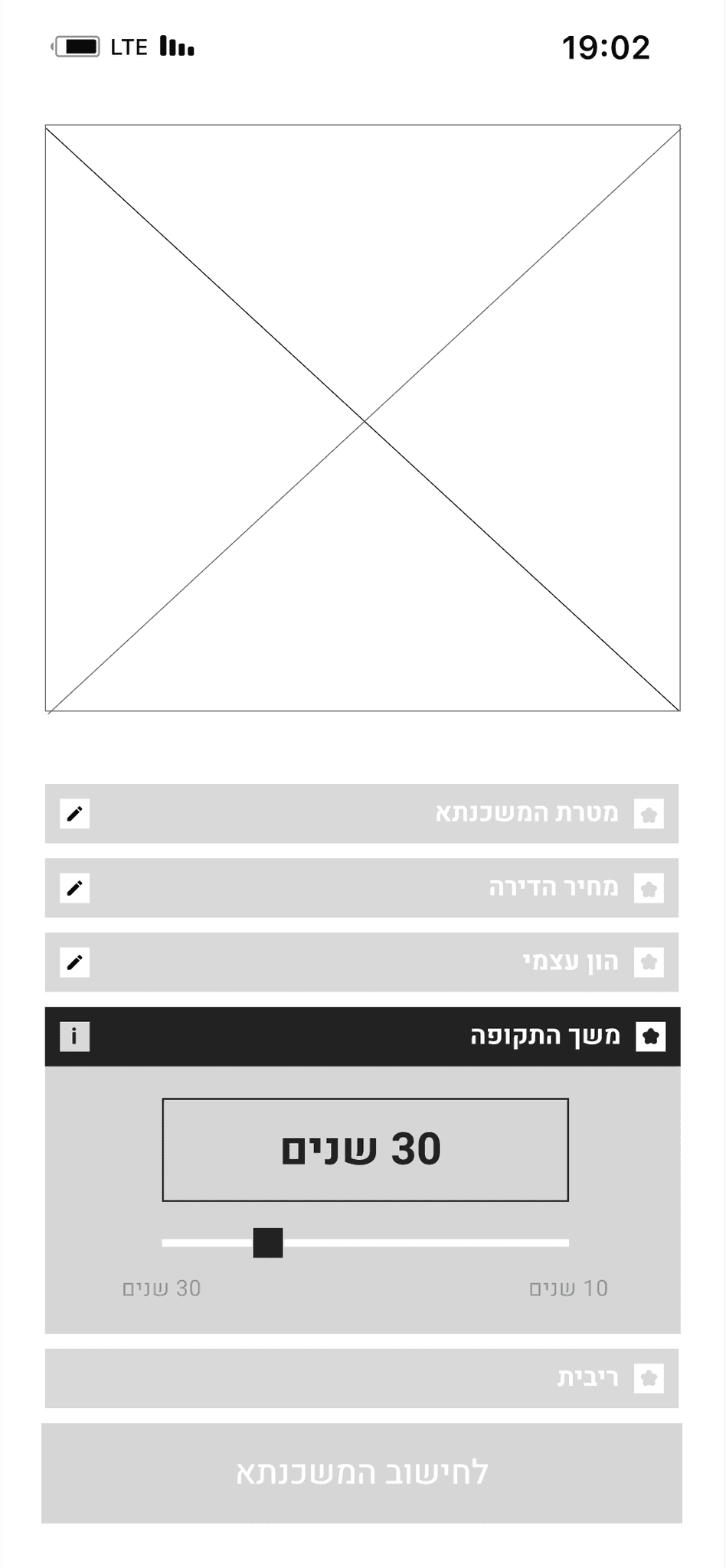
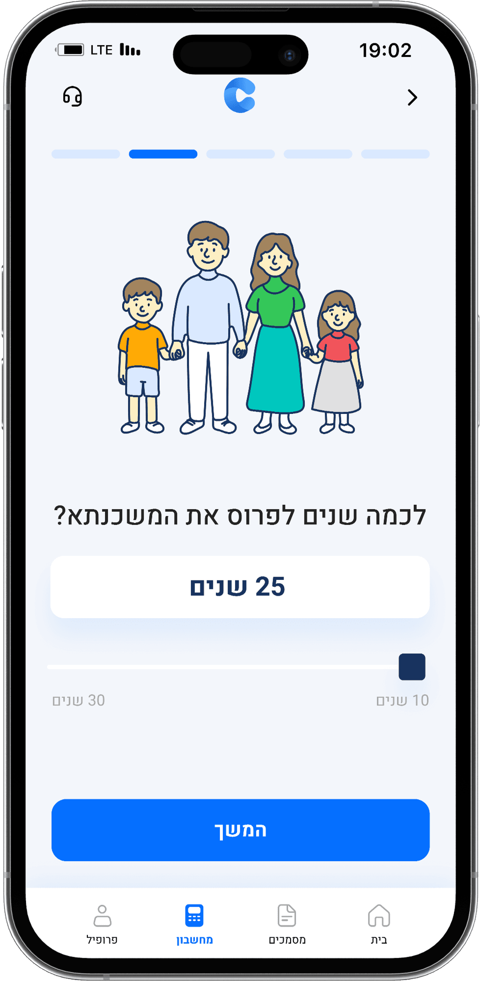
Loan duration screen

Interest type screen

Sahar Ben Ezra (cantaio's product manager)
Components – I like the use of sliders and icons. I think it reflects our goal to give the user full control and the ability to play with the numbers.
Layout – I think the layout is a bit boring. I see the movements you mentioned, but for the user, everything feels predictable and less exciting.
Me
I think I might try to completely split the screens, so that each user choice has its own screen. That way, I can give more attention to each step.

Round 2/3 — Add more screens & splitting them + combining smart micro copy

Property type screen

Property price screen

Equity screen

Loan duration screen

Interest type screen

Final results screen
Live simulation screen

Pro plans screen
Final results screen
Sahar Ben Ezra (cantaio's product manager)
Huge improvement – I think splitting the screens really helps the user feel that each step matters. It also feels calmer and more reassuring. Plus, each screen has enough breathing space, which is super important.
Concept explanations – It’s great that you added them, but if the text is too long, it creates visual overload, even when the component is collapsed.
Plans screen – Try changing the layout inside each plan to a vertical layout. It might make it easier for users to scan the information. It’s not a must, but worth testing.
Hagar + Me
No problem. About the explanations, maybe we can use
a ״toast component״ instead. That way it takes up less important
space on the screen and reduces the visual clutter. We'll update it."

Round 3/3 — Final wireframes

Property type screen
Property price screen

Equity screen

Loan duration screen

Interest type screen

Loading screen

Final results screen

Live simulation screen

Pro plans screen
Custom Illustrations